
“I want to effectively utilise data, but I am unsure of what steps to take.” This concern is quite valid. Descriptive statistics, while fundamental, can serve as a powerful tool for understanding the characteristics of data, informing current assessments, and guiding future strategies. In this article, we will explore the basics of statistics, including what descriptive statistics are, their significance, a comparison with inferential statistics, and various methods within descriptive statistics, using concrete examples. By learning how to extract meaningful information from data through descriptive statistics, you can leverage it effectively.
1 What is Descriptive Statistics?
Statistics, broadly defined, can be summarised as follows:
The process of obtaining appropriate data, examining the characteristics of that data and the population from which it is derived, and using this data to make inferences about future conditions.
For now, it suffices to understand it in this manner. Descriptive statistics involves the use of numerical measures, referred to as “statistics”, and graphs to analyse the data at hand. What does it mean to examine the data itself? Let us consider an example.
1.1 An Example of Descriptive Statistics
Now, I have harvested cucumbers from my home garden (Figure 1). What is the approximate mass of one cucumber this year? It would be advisable to measure the mass of the harvested cucumbers and calculate the average.

Assuming that the mass of each cucumber harvested this year is measured individually, the following data (in grams) is obtained. While this information is based on actual data, it serves solely as a reference for explanatory purposes.
284, 529, 255, 347, 280, 516, 147, 305, 341, 407, 429, 327, 508,
407, 730, 133, 453, 203, 240, 657, 621,  81, 326, 350,  40, 352,
419, 392,  60, 526
Mean: 355.5In reviewing this data, we cannot determine the exact mass of cucumbers. Therefore, we will calculate the average. This gives us an estimated value of 356 g. Although there is significant variation, it can be stated that when picking an average cucumber from our home garden, its weight is probably near this amount.
Considering this example, the focus of our study includes all cucumbers grown in our home garden. After harvesting the cucumbers, weighing them helps us look at the whole group. This method is known as a census, which means examining all items of interest. Descriptive statistics relies on this complete survey. In this situation, we found the average weight of all the cucumbers harvested from our garden, which connects to the idea discussed in Section 1 about analysing the data itself. To enhance our understanding, let us compare descriptive statistics and inferential statistics.
1.2 Comparison of Descriptive Statistics and Inferential Statistics
In inferential statistics, the focus shifts from directly examining data to analysing the characteristics of a larger group known as the population represented by the data. To clarify this concept, consider the following example.
To determine the average weight of cucumbers grown in Japan, one might assume it aligns with my garden’s average of 356 grams. However, this may not be accurate. Cucumbers can grow quickly and significantly if not carefully monitored, leading to potentially misleading data.
Therefore, instead of focusing on a single home garden, we need to evaluate cucumbers harvested throughout Japan. However, this process differs greatly from measuring those in a home garden. In the previous example, it was possible to measure every cucumber from a home garden. In contrast, measuring every cucumber harvested in Japan and calculating their average is nearly impossible because of their vast number.
Since we cannot look at all cucumbers in Japan, how can we discover the average weight of those harvested there? While no one knows the exact number, we can estimate a reasonable figure. First, we should choose a sample of cucumbers that closely represents (or is thought to represent) the overall group (cucumbers grown in Japan) using a specific method. This will stand in for Japanese cucumbers. Collecting these cucumbers is called taking a sample, and we estimate the average weight of all cucumbers in Japan based on the average weight from this sample. As with the earlier home garden example, if the sample is biased, it will make it hard to estimate accurately the average of the entire group. If only unusually heavy cucumbers are included in the sample, then naturally, the average derived from this sample will be higher than that of the true population.
In summary, inferential statistics uses samples to examine characteristics of groups that cannot be fully surveyed. However, while there are notable differences between descriptive and inferential statistics regarding their subjects of study, inferential statistics also starts with calculations and graphical representations similar to those in descriptive statistics. Therefore, understanding descriptive statistics is very helpful when trying to gain insights about populations.
2 How to Gather Valuable Insights from Data Using Descriptive Statistics
What techniques can be used in descriptive statistics to analyse the data itself?
Depending on the data type, it can be seen as a set of numbers. The unprocessed data that has not been turned into charts or tables is known as raw data. Merely observing this raw data does not show the features of the data. For instance, take a look at these numbers.
207.9, 282.1, 403.4, 424.4, 572.5, 361.7, 374.5, 332.3, 309.4, 428.2, 385.3, 329.3, 242.,
337.7, 310.9, 475.5, 444.7, 247.8, 466.7, 292.8, 363.3, 470.3, 247.5, 366.,
237., 155.9,
448.7, 352.8, 267.8, 191.3
Can you identify any characteristics of the data? It is often difficult to see features just by looking at a series of numbers. In descriptive statistics, we mainly summarise data using two methods:
Calculation of statistical measures (quantitative analysis)
Creation of tables and graphs (visual representation)
By calculating numerical values known as “statistics”, we can summarise the data in numerical form, making it easier to compare with other data. On the other hand, using tables and graphs allows for a clearer visual understanding of the data. This approach helps reveal overall trends that might not be evident from statistics alone. Both methods are important rather than just one.
Next, I will briefly introduce representative statistics and charts.
Note: “Statistics” has mainly two meanings: a field of study and measures representing the characteristics of data.
2.1 Organising Data with Statistics
There are three main types of statistics:
- Measures of central tendency, which indicate the centre of the data distribution (mean and median)
- Measures of dispersion, which describe how spread out the data is (range, standard deviation, interquartile range)
- Measures of skewness (skewness)
Data does not always yield the same values; it can be thought to follow some kind of distribution (Figure 2).
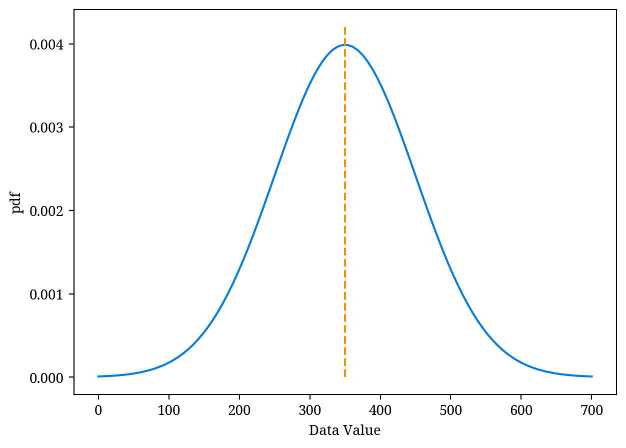
This shows the value of each data point (data value) along with its respective frequency. The orange dashed line represents the average value of the distribution.
A measure of central tendency indicates a single value that represents the centre or typical value of a dataset. We can imagine that data tends to cluster around the value. Measures of central tendency include the mean and median. Depending on the data, the mean may be suitable or the median might be more appropriate, making it important to choose wisely.
Even if the measures of central tendency are the same, the distribution of the data can vary significantly. Whether the data is concentrated around the value or spread out can be quantified using statistics that express data variability. This group, measures of dispersion, includes range, standard deviation, and interquartile range. Standard deviation is typically used alongside the mean, while interquartile range is paired with the median.
Though not explained in this article, it’s beneficial to understand why standard deviation is used with the mean and why interquartile range accompanies the median, as well as why standard deviation is preferred over variance.
In Figure 2, the data is symmetrically distributed, but actual data does not always conform to this. Distributions can also be skewed to the right (right-skewed distribution) or left (left-skewed distribution), as seen in Figure 3.
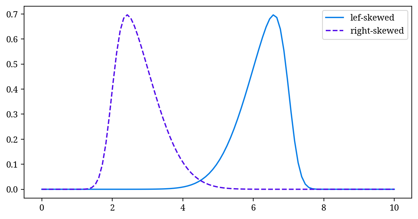
This degree of distortion is called skewness and serves as a statistical measure of the distribution’s shape.
2.2 Organising Data Using Tables and Graphs
Here, we will introduce a typical graph.
Histogram
A histogram represents the distribution of data. The horizontal axis shows the values of the data, while the vertical axis indicates the frequency of that data. More precisely, when displaying data on the horizontal axis, the data is divided into suitable widths. The vertical axis represents the number of data points within that width (Figure 4).
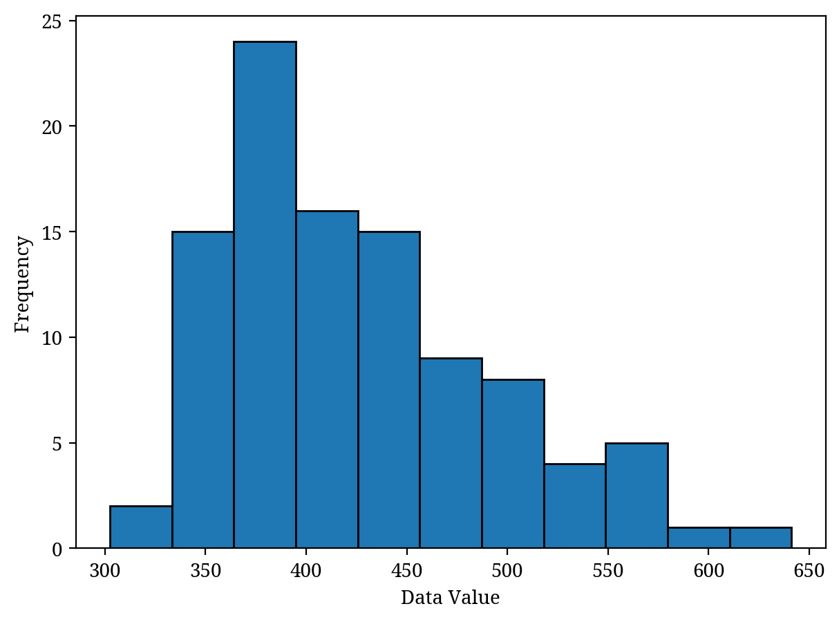
A histogram is often necessary before performing advanced analysis methods. First, you should use a histogram to understand the distribution of the data, make any necessary adjustments, and then apply the analysis techniques. In this way, histograms are one of the most important types of charts.
Box Plot
While histograms are very effective for showing data distribution, they may not always be easy to understand visually when comparing multiple distributions.
When comparing several datasets, it is better to use a box plot instead of a histogram. A box plot effectively summarises various information about the data distribution, including the central tendency, variability, and outliers (Figure 5 (b)).
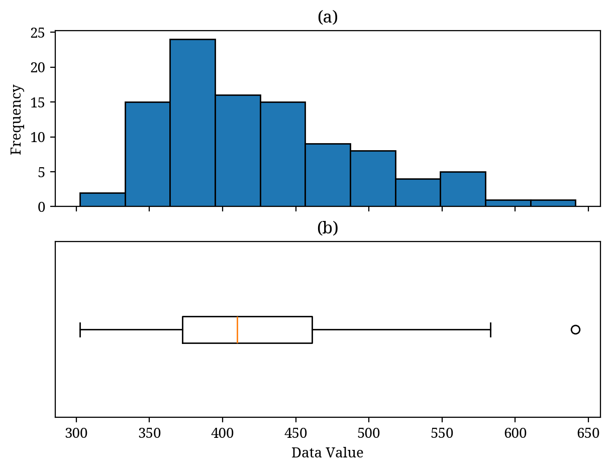
A box plot (b) summarises the histogram (a). (b) Orange line: median. White circle: outliers.
A box plot is a diagram that summarises a histogram. Therefore, as shown in Figure 5, we can match the histogram (a) with the box plot (b) (while Figure 5 displays both the histogram and box plot for learning purposes, typically one is used depending on the objective).
In Figure 5 (b), the orange line represents the median, and the horizontal length of the box indicates the interquartile range (variability). While details are omitted, the black lines beside the box usually represent the data’s minimum (left) and maximum (right) values. The white circles indicate outliers (values that differ significantly from other data). In this case, because outliers are present, the black line on the right does not represent the maximum value of the data.
It is important to be able to imagine the histogram (data distribution) from the box plot.
Bar Chart
A bar chart is a familiar diagram. At first glance, a histogram (Figure 4) and a bar chart (Figure 6) might seem similar, but they are actually completely different graphs. A histogram displays numerical data (real numbers) on the horizontal axis, whereas a bar chart represents categories like Group A and Group B.
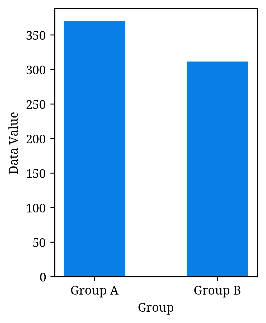
This time, we are not illustrating error bars in the context of descriptive statistics, but when we want to estimate the population mean, we display the error bars on a bar graph.
Scatter Plot
If there are two pieces of data for each subject surveyed, such as height and weight for an individual, creating a scatterplot (see Figure 7) makes the relationship between the two data sets easier to visualise.
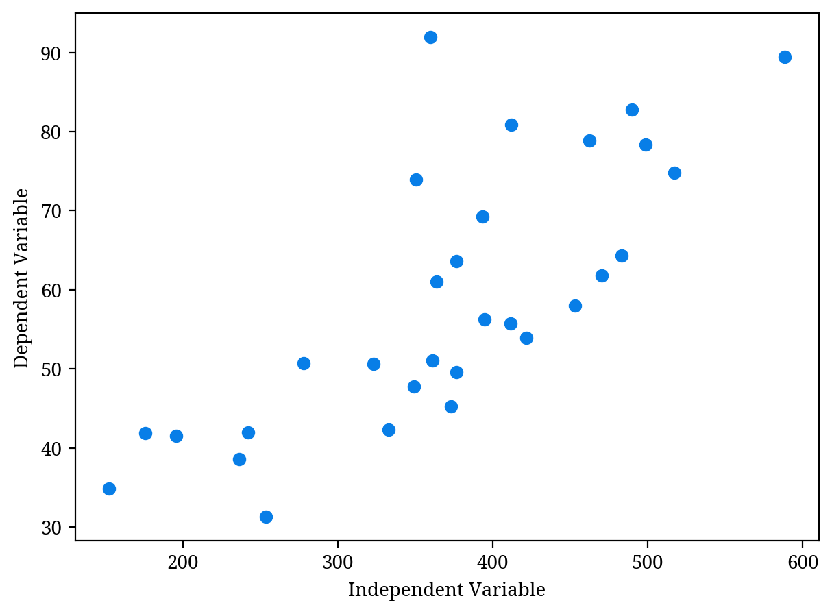
After visualising the relationship between two sets of data using a scatterplot, you may also calculate the correlation coefficient or conduct regression analysis.
- Correlation Coefficient: A value that quantifies how two sets of data are related
- Regression Analysis: A method used to predict the value of a dependent variable when new independent variables are obtained
3 Summary
This article explained descriptive statistics to effectively utilise data. Descriptive statistics allows for summarising data using statistical measures and graphs. These approaches greatly aid in understanding the characteristics of the data and form the foundation for inferential statistics. Let us deepen our understanding of data by using appropriate statistical measures and graphs.


